Marketing Research: Detailed Analysis of Marketing Campaign Performance
Marketing research is a set of activities used by businesses to gather information in order to better understand their target market.
It is employed to ascertain what customers desire and how they respond to the product’s features or other offerings. The information gathered is utilized to enhance user experience, develop products, and target the right customers.
In this analysis, we analyzed marketing data using Power BI to better understand the performance of different marketing campaigns and promotions.
The Power BI file can be downloaded in my Github repository here.
Objectives of this Marketing Research
The overall objective is to analyze the data and derive insights that will help improve the company’s next marketing campaign. This will help the company to save costs while targeting appropriate customers.
In this analysis, we shall be using Power BI specifically,
- To determine the best-performing campaign, and
- To determine the campaign’s acceptance level based on the customers’ demography.
Table of Contents
Data Exploration
The data for the analysis was downloaded from the Kaggle marketing dataset. It has 39 columns and 2205 rows.
The data is clean since it has already been transformed for EDA (Exploratory data analysis) by the provider of data.
But we shall make some adjustments to help us achieve our objectives using Power BI. This is because the downloaded data was transformed for linear regression and machine learning.
First, to make sense of the data, we divided the overall dataset into four (4) different tables representing the 4Ps of marketing:
- The customer profile (People)
- The products offering (Products)
- The channels of product distribution (Place)
- The business promotions which include campaigns and discount offerings (Promotions)
Before splitting the table, an ID field was created since none was present in the downloaded table. This was used to create a unique identifier for each record in the tables as well as maintain their relationships.
Thus, we had the following tables to work with:
- Customers table
- Products table
- Sales channels, and
- Campaigns
We then performed the following data transformations on the different tables:
Customers table
- The data type of the Income column was changed from numeric to currency.
- The Kidhome and Teenhome columns are combined into the haveKids column, after which we removed both columns
- The Customer_Days column was renamed to CustomerLifetimeDays.
- Columns with marital_Divorced, marital_Married, etc. were combined into one column. The new column was renamed maritalStatus. The previous columns were removed.
- Similarly, we combined the various education levels: education_2n_Cycle, education_Basic, etc, into one column and renamed it educationLevel
- Moreover, the “2nCycle” is assumed to refer to a “Masters” degree. To balance the terms, we changed all “2nCycle” into “Masters”
After all transformations, we are left with 8 columns as follows ID, Income, haveKids, complain, age, customerLifetimeDays, maritalStatus, and educationLevel.
Products table
The columns in the products table represent the amount each customer spent on each product in the past 2 years. The following transformations were made:
- The columns were renamed to have the correct product name, e.g. Fish, Sweet, etc.
- The products columns were unpivoted in Power Query so we could have a single column named Products. This will enable us to filter products in our BI report.
- Because the original ID field was no longer unique, we created a Unique ID field called Transaction ID.
The products table ended up with 4 columns.
Channels table
Nothing was changed here, but we added a column called totalPurchases. This column sums the purchases made by each customer via the three channels.
Campaigns table
The following changes were made:
- The columns were renamed to have the correct campaign/ sales promotion name, e.g. Discounts, Campaign 1, Campaign 2, etc.
- The campaigns and discount columns were unpivoted in Power Query; so we had a single column named Campaigns. This will enable us to filter campaigns in our BI report.
- The campaign value column was renamed No. Accept. This means the number of campaigns accepted by each customer.
- Because the original ID field was no longer unique, we created a Unique ID field called Campaign ID.
The Campaigns table has 4 columns: Campaign ID, Customer ID, Campaigns and No. Accept.
Data Analysis
Firstly, we created a card to display the total number of campaigns accepted. When filtered, we will see how many campaigns were accepted for each campaign and discounted sales.
We created a second card to display the total amount spent by customers during the analysis period. When filtered by products, we shall see how much was spent on each product.
Let us now focus on our objectives by answering the questions of interest to management.
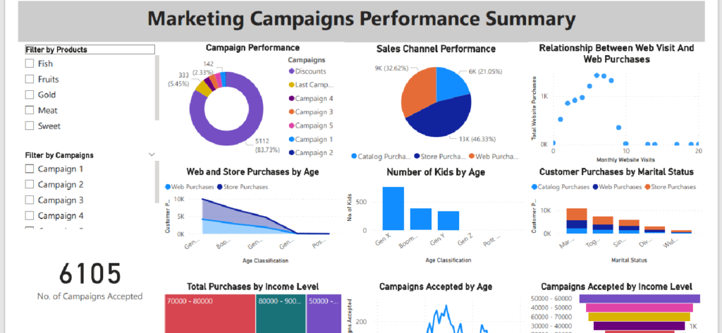
What is the best-performing campaign?
Of the six (6) different campaigns launched, only the last campaign had a substantial acceptance. The second campaign was the worst performing, with an acceptance rate of 0.49%.
Comparing the outcome of the campaigns to discounted sales, we observed that customers were more responsive to discounted sales than campaigns.
The analysis shows over 5,000 number of discounted sales. That is about an 83.73% acceptance rate of all sales promotions initiated.
This means that discounted sales have more impact on the customers than other sales promotions.
However, the tactics used in the last campaign may be refined and tried in subsequent campaigns. The last campaign had the highest acceptance rate of 5.45%.
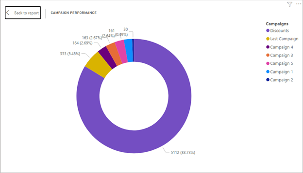
Which sales channel was mostly used by customers?
From the pie chart, 46.3% of all sales came from the store, 32.6% from the web, and 21.1% from the catalog.
This shows that customers prefer onsite purchases to other channels. Some factors may be responsible for the onsite preference. This may include proximity, customer service, age of customer, etc.
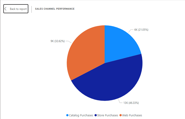
Since customer age was measured, we looked at the relationship between age, web purchases, and store purchases.
The chart shows that the web channel is gaining traction. When we plotted the relationship between website visits and purchases, we observed that on average, as website visits increase, website purchases also increase.
Why are there more store purchases than other sales channels?
Before proceeding with this, we had to add more columns to our customers’ table. We added the following columns in Power BI:
- IncomeLevel – In this column, we grouped the customers by their income level. According to Gapminder, there are four (4) levels of income as follows:
- Level 1: People who earn less than $2 per day. When we subtract Saturdays and Sundays, it becomes $10 per week. When we multiply by 52 weeks, it becomes $520 per year.
- Level 2: People who earn between $2 and $8 per day. This becomes between $520 – $2080 per year.
- Level 3: People who earn between $8 and $32 per day. When adjusted per annum we have $2080 – $8320.
- Level 4: People who earn above $32 per day which becomes >$8320 per annum.
If we use this income category, it will be misleading in our analysis since only 24 customers earn below $32 per day. Therefore, we created 10 groups of $0 – 10000, $10000 – $20000, … $90000+.
Using the following DAX function, we created the income level column:
IncomeLevel = SWITCH( TRUE(), Customers[Income] <= 10000, “0 – 10000”, Customers[Income] <= 20000, “10000 – 20000”, Customers[Income] <= 30000, “20000 – 30000”, Customers[Income] <= 40000, “30000 – 40000”, Customers[Income] <= 50000, “40000 – 50000”, Customers[Income] <= 60000, “50000 – 60000”, Customers[Income] <= 70000, “60000 – 70000”, Customers[Income] <= 80000, “70000 – 80000”, Customers[Income] <= 90000, “80000 – 90000”, “90000 +”)
- AgeClass – Using the Gen Z classification ages in 2023, we can define the following age classifications according to Beresford’s research.
- WWII: People born between 1922 and 1927 of ages 96 – 101.Post-War: People born between 1928 and 1945 of ages 78 – 95.Boomers: People born between 1946 and 1964 of ages 59 – 77.Gen X: People born between 1965 and 1980 of ages 43 – 58.Gen Y (Millennials): People born between 1981 and 1996 of ages 27 – 42.
- Gen Z: People born between 1997 and 2012 of ages 11 – 26.
Looking at our customers’ age data, we have between 24 and 80 years old. Thus, we created five (5) groups using the following DAX statement:
AgeClass = SWITCH(TRUE(), Customers[Age] <= 26, “Gen Z”, Customers[Age] <= 42, “Gen Y”, Customers[Age] <= 58, “Gen X”, Customers[Age] <= 77, “Boomers”, “Post War”)
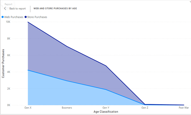
From the chart, we observed that both store and web purchases were dominated by Gen Z and Baby Boomers within the age bracket of 43 – 77.
When we dig deeper, we found that these age brackets also have more kids as shown in the chart below.
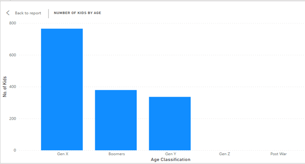
So, family commitment could be the reason they spend more. Also, channel preference and convenience could have made them choose any of the stores and web.
However, a very critical factor responsible for the increased purchases by Gen X and Boomers is their income level. These age groups have the highest number of income earners.
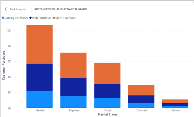
Furthermore, those who are married or together made more purchases using the 3 channels.
Does the level of income affect customer purchases?
Definitely. The analysis shows that those with the least income (0 – $40k) had the least purchases.
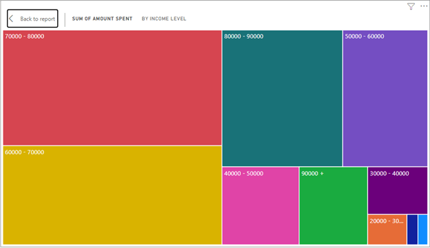
Generally, customers earning between 50k to 90k made the most purchases within the period of analysis.
Conclusion
In conclusion, we observed that customers prefer sales discounts to exclusive campaign offers. Thus, exclusive sales campaigns do not significantly affect customer purchases.
However, if campaigns are to be launched, customers between the ages of 39 to 71 years can be targeted. This is because this age group had the highest campaign acceptance.

This is the age bracket that also has more kids.
Finally, customers within the income levels of 50k to 90k should be targeted.